Final Visualization
Sketch iteration documentation (paper/hand-drawn photos)
Design process: I started with four sketches before writing any code. Sketch 1 focused on the African continent alone, with red arrows of varying thickness flowing from neighboring countries into South Africa.
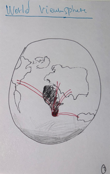
The note in the corner "the size of the arrows are based on the amount of immigrant" set the core encoding principle early: line thickness as a proxy for migrant stock. Sketch 2 I tried a globe/sphere perspective, which looked
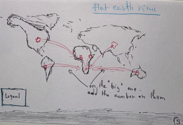
dramatic but made it hard to read individual country contributions because of foreshortening. Sketch 3 I went flat, a full Mercator-style world map with origin dots in Europe, Asia, and Africa, each sending curved arrows to
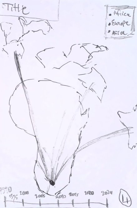
South Africa. This solved the readability problem but wasted space on the Americas and Oceania, which contribute almost nothing to SA immigration. Sketch 4 refined sketch 3: it dropped the western hemisphere, added a title
block, a color-coded legend (Africa/Europe/Asia), and a timeline slider along the bottom (1990–2024). This became the blueprint for the final P5.js implementation.
Why this dataset and title: I chose the UN DESA International Migrant Stock 2024 bilateral dataset because it provides exact origin-to-destination counts, not just net migration totals, for every country pair
across eight time points. The topic is personal and timely: South Africa has been in the news recently for a surge in xenophobic violence, with native South Africans directing anger at immigrants they blame for taking jobs
and straining public services. I wanted to see the actual data behind the headlines. Where these immigrants are coming from, how many there really are, and how those numbers have changed over three decades. The title "Where
Are South Africa's Immigrants Coming From?" frames the visualization as a question the viewer answers through exploration: scrubbing the timeline reveals how Zimbabwe's share exploded from ~89K in 1990 to over 1 million by
2024, while the UK's colonial-era presence steadily shrank.
Author-driven vs. user-driven: This is a hybrid, primarily author-driven with a user-driven layer. The author-driven elements are the curated set of 20 countries (the top origins across all years), the map
crop, the color encoding by continent, and the narrative framing through the title. The user-driven element is the interactive time slider, which lets the viewer control which year's data they see and discover the story at
their own pace. The hover tooltips add a detail-on-demand layer. The visualization genre is a narrative flow map, it combines geographic mapping with proportional flow lines and temporal navigation.
Walking through the visualization: If I were presenting this in a talk, I would start at 1990 and point out that the UK was the second-largest source of immigrants; a legacy of colonial ties. While Mozambique
led due to the aftermath of its civil war. Then I would scrub forward to 2005–2010 and highlight the dramatic surge from Zimbabwe, which coincides with the Zimbabwean economic crisis and hyperinflation. By 2024, Zimbabwe alone
accounts for over 40% of all immigrants in South Africa. I would also point to the emergence of East African and South Asian flows (Ethiopia, Bangladesh, Somalia) starting around 2005, and the steady decline of European-origin
populations. The inset map lets me zoom in and show how the southern African cluster (Zimbabwe, Mozambique, Lesotho, Malawi, Eswatini) dominates the picture, with arrows so thick they visually crowd the region, which is exactly
why the inset exists.
User feedback Interview 1: The first person I showed this to immediately noticed the thick red arrow from Zimbabwe and said "that one country is doing all the heavy lifting." They scrubbed the slider back to
1990 and were surprised to see the UK as a major source. They pointed out that the proportional thickness made it easy to compare countries at a glance without reading numbers. Their main critique was that the southern African
countries were hard to distinguish on the main map because they are so close together; which initiated the decision to add the inset map.
Self-reflection / future work: Looking back, I think the visualization effectively communicates the core narrative that South Africa's immigrant population is overwhelmingly African, increasingly dominated
by Zimbabwe, and that European-origin populations are in long-term decline. The proportional flow lines and time slider make this story explorable without requiring the viewer to read tables. With more time, I would add a stacked
area chart alongside the map to show the composition over time in a second encoding. I would also improve the continent outlines to use actual GeoJSON data instead of hand-traced polygons. The inset map could also benefit from
a magnifying-glass visual cue connecting it to the main map's southern Africa region.